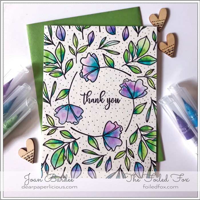
Beautiful Bloominous Wreath by Joan Bardee
Hi Crafty Friends,
It is another red-letter day – we get to share another beauty from Joan Bardee and her Dear Paperlicious blog. As you know, Joan makes the most creative card designs and as an extra bonus, we are treated to one of Joan’s fun anecdotes – YAY!
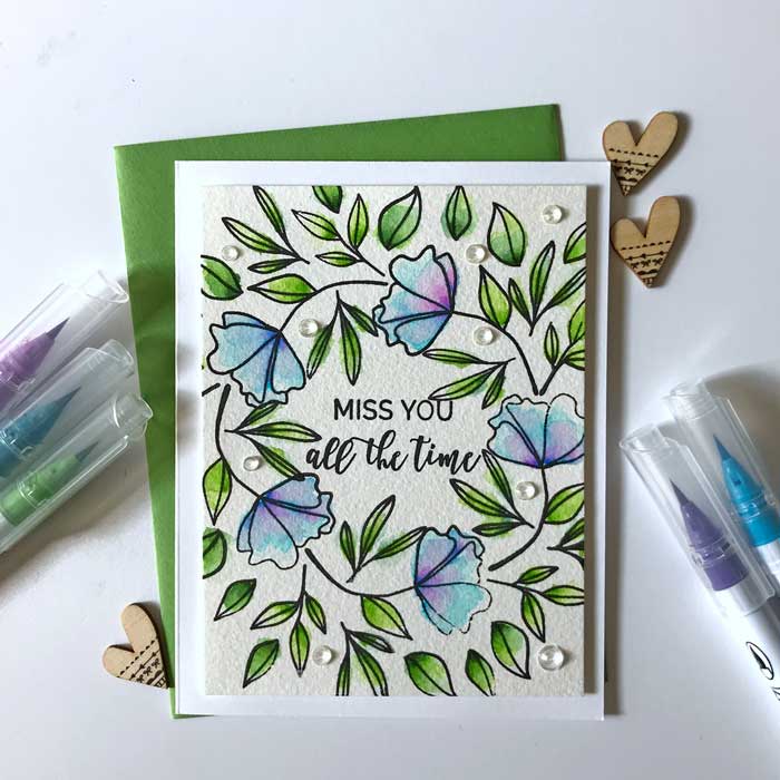
Happy to be back on the Foiled Fox blog! Today I’m sharing a couple of similar cards that use The Stamp Market’s Bloominous set. But, I’m mainly talking about math and design.
I wanted to stamp a wreath and didn’t want to use a template for wreath building, mainly because I don’t have one. So, after practicing on some typing paper, I curved one of the flowers from Bloominous and stamped it in a circle of sorts. I like the fact that it’s not really a circle because I. Am. Not. Hallmark.
However, while there is a lot to like about this card, the flowers and leaves crowd the sentiment just a bit and are not perfectly centered. So, I decided to try again and made version #2.
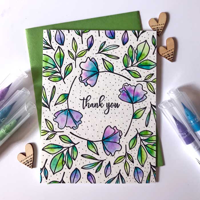
The cards are pretty similar and use nearly identical supplies. Both use cold press watercolor paper, Zig Clean Color Markers, and Versafine Clair Nocturne ink. But they are a little different. Before you continue reading, take a closer look at each card. What are the differences? Which do you prefer? Why?
I prefer one-layer cards with no embellishments, so the second card is my favorite, even though something about it was bugging me. When I’m not sure what’s up, I
show my cards to my husband and sometimes my son. They are both honest and have no problem crushing my dreams!!
Actually, it’s very helpful to get out of the stamping/papercraft social media world and get feedback from someone who doesn’t make cards. Sometimes we can get so caught up in what everyone else is making, and what is trendy, that we start making things that we don’t like. I don’t know about you, but I don’t like every trend and it’s a waste of time and money and effort to make things because I think I should like them.
Here’s how it went when I asked my son about these cards.
Son, pointing to Card #1: “This is better. It has 5 flowers instead of 4. Don’t ever make anything with an even number of flowers.”
Me: “But the saying on the first card is crowded.”
Son: “It’s fine. Quit overthinking. “
My son created exactly two art things in preschool. He didn’t like painting or coloring or doing anything with his hands. So, rather than gluing elbow macaroni to construction paper, he sat around preschool thinking about numbers. This led to lots of parent-teacher conferences, where my husband and I would worry about the lack of macaroni gluing. Luckily, there’s not a big market out there for gluing macaroni to anything and there is a market for kids who can count so he is doing just fine!
It’s not surprising that a math kid, even one who never made any art, recognized a basic design principle that odd numbers of things are more pleasing to the eye. If you have 2 flowers (or 4) on a card, or two vases on a mantle, your eye has no reason to look at one more than the other. It can get lost. But if you have 3, your eye is forced to move around, or to settle on the middle one. If my explanation doesn’t make sense, don’t worry. I’m not a math person and I don’t have any background in graphic design. I’m just repeating what I’ve read and what makes sense to me.
Interestingly, much of graphic design is based on math — google “mathematics and graphic design” and you’ll see thousands of articles. So when my son chose the card with 5 flowers, rather than the one with 4 flowers, he was demonstrating, at least to me, the connection between math and design.
Nevertheless, I still prefer the card with only 4 flowers – the sentiment in the center helps focus your eye, despite the fact that I’ve committed the design sin of using an even number of flowers. And, sometimes we can just like something for no reason at all — even if breaks a rule and even if no one else does. Really.
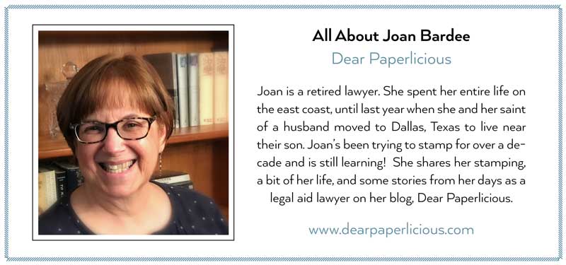
Learn more about Joan:
Goodies Used:
Sorry, the comment form is closed at this time.

June 5, 2019
Cacia
I like the second card best too—even though it has an even number of flowers, that is counterbalanced by its symmetry, and the greater amount of white space allows the sentiment to breathe and the eye to focus on the sentiment. In the first card, the crowded sentiment gets a bit lost among the flowers, so there isn’t a good resting spot for the eyes, which makes the card feel a lot busier to me—even though technically there’s more going on in the second card! I’ve always been fascinated by the way math and graphic design intersect, and I think one of the reasons card-making has caught my interest so fully is because of the way it blends practical mathematics with useful creativity.
I love the way you blended the colors of the flowers and leaves in the second card! The blue-greens and blue-purples are so pretty, and the soft watercolor effect works splendidly with the design of the card and of the stamps. Your gorgeous coloring makes me want to color something. The best sort of art is the kind that’s contagious, so thank you, Joan!
June 5, 2019
Betty
both are really pretty, Joan and love the colors you chose – but i’m with your son on liking five rather than the four but that’s just me with the odd number thing – like two together, one apart when putting on sequins or embellishments or the triangle when stamping a background – viva la differance!!!
June 6, 2019
Kathy D
Joan, both cards are lovely. I am usually an odd number of things person, but I am more drawn to your 4 flower card – I think because the sentiment doesn’t feel crowded. Did you dot the background by hand?
June 6, 2019
Joan Bardee
thanks. yes, I did dot it by hand!
June 6, 2019
Michele F
It’s the dots for me, Joan! they make me love them!
Now. if one concentrates on the blooms, not the stems on card one, that even/odd number thing works! At any rate… you made me love that set! happy to call it mine at last!
=]
June 6, 2019
Beth
I like the open space with four flours. Pleases my eyes just fine! (Never any good at math).
Maybe no inner circle leaves on the 5 flours…….a little pruning. Opens up the space.
Both beautiful.
June 6, 2019
Nance in Reno
Hmm, I wonder if both Joan and her son would have liked the 5-flower card redone as one-layer card with no “raindrops” and a smaller sentiment? It would have an odd number of flowers, which I like, and a little more space so the sentiment has “room to breathe.”
June 6, 2019
Lagene
Both cards are so pretty, but I prefer the card with 4 flowers! I appreciate the lack of crowding and the added purples in a few of the leaves in the background cause the eyes to move around. Maybe leaving the leaves out of the inner circle on the first card might have lessened the sentiment crowding.
June 6, 2019
SusanH
Hi Joan, Both are lovely cards. They both work for me. 🙂
June 6, 2019
Bahb
Hate to be odd-man-out, but I much prefer the first card, firstly because of the 5 flowers looking less regulated. 4 ALMOST makes a square wreath.Secondly because the first card looks more graceful and sophisticated and finished. The dots on the second card just hit my button that thinks black dots look kind of like cheating to fill space. i almost never like the look of black dots. I LOVE the texture of the paper on the first card, which I think makes it look expensive. And I love the subtle,perfectly-place bling on the first. I would expect to pay more for the first card, if I were buying it from a rack of cards in a store. I don’t think the sentiment on #1 looks crowded. it looks perfectly-placed to me, and the font is perfect. #2 is a fine card. But I would choose #1, if I were buying.
June 6, 2019
Bahb
Ooops! There are actually 3 cards on my screen now, but there were only 2, or maybe I’m a ditz! Five flowers is #1 card in my first comment, and #2 card has 4 flowers. Sorry!
June 6, 2019
Leslie Miller
Interesting, including the responses. Even though I usually go for an uneven number, there are exceptions to every rule. It didn’t strike me that there were 4 flowers on #2. I like the openness of that card and it’s the number of flowers that makes all the difference. I like the tiny dots and the lack of embellishments. I like your coloring/shading on #2. Maybe the reason 4 flowers look okay to me is because they form a continuous loop and the eye keeps moving. Who knows? Art is subjective. I simply like the card. Thanks, Joan.
June 6, 2019
Judy
Both of Joan’s cards are lovely, although I prefer the 2nd one. I don’t think it matters that there are an even number of flowers because the flowers are surrounded by leaves. Fewer flowers allows for a more organic shape to the flower stems. The second card looks less crowded and I agree with Joan that the sentiment in the center helps focus the eye. I also love the additon of purple to some of the leaves.
June 6, 2019
Laura Jane
I think the card with 4 main flowers looks better because of the dotted background and less crowded sentiment. Your son is also correct about grouping things in 3 for design perfection, But I of the opinion that Perfection is not to be found among the mortals 🙂 Great to see you making cards again Joan!
June 7, 2019
Suzanne Russell
My preference is for card #2. Card #1 feels crowded and a bit overworked with the raindrops. Five flowers might have been fine but the five stems are too much for me. Love the tiny black dots. They ground the whole design.