Beautiful Petals – Two Ways
Hi Creative Friends,
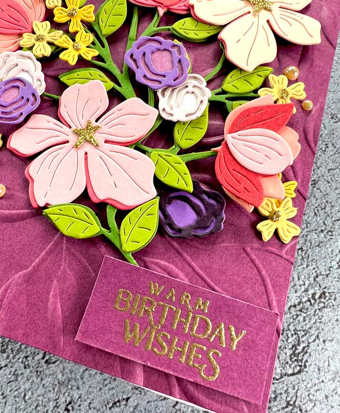
I have been having the best time creating with the beautiful Four Petal Thank You Floral die set by Spellbinders. There are so many ways you can use this set! I chose to make a floral display that was bursting with colors and flowers. I was having so much fun with this set that I created the same flowers on two different background colors. I rarely create two cards the same, but I couldn’t help myself! You will have to let me know which version you like the best by commenting on our blog or Instagram. For those of you that do play along, you will be entered into a drawing for a $25 gift certificate to our shop – woohoo! Be sure to let us know how to contact you if you are the lucky winner!
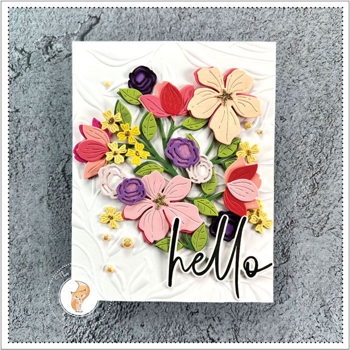
Both of these cards start out with an A2 card stock card base and both have the same leafy background. One background was embossed using the Leafy 3D embossing folder by Spellbinders and a white cardstock panel, and the other with a Mulberry cardstock panel. Each was mounted onto a card base.
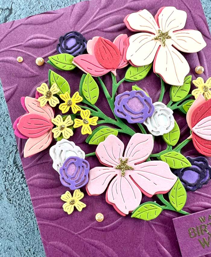
Next, since there isn’t any color blending with this card design, to get the explosion of color, I cut out all the flowers and leaves from a variety of colored cardstock. If you are like me, you have lots and lots of scraps. I used my scraps to make the flowers but another very handy way is to use paper from a colored cardstock paper pack. I have listed a few that have awesome colors to choose from.
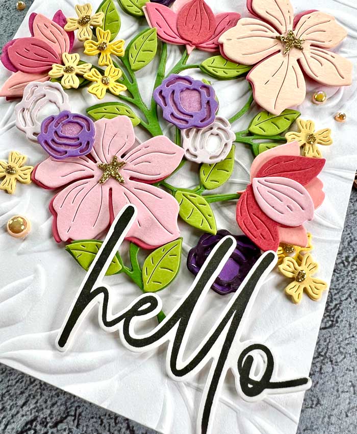
The stems are quite willowy so to give them more strength I did cut out two pieces of the stems, then stacked and glued them together.
One of the choices you have when using this floral die set is to decide how many flowers you would like to use. I decided to have a bouquet filled with lots of flowers so I cut multitudes of flowers, then played around with the display. When the display was set, I used foam squares to attach the flowers to the stems and added glittery centers to the flowers by using a piece of gold glitter paper. These centers are hard to see in the photos but in real life, it really adds a sparkly bit!
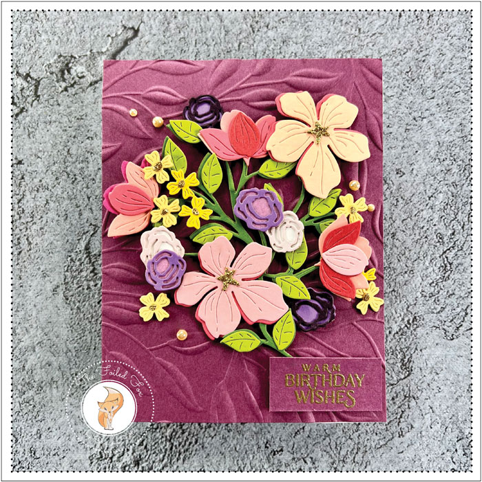
When the bouquet was done, it was spot-glued to the top of each leafy background and a sentiment was chosen. For the Mulberry purple background, I stamped with Versamark ink, then gold heat embossed a simple greeting onto the same Mulberry card stock using Papertrey Ink’s Just Sentiments: From All Of Us stamp set.
For the white background, I stamped the Hello from the Perfect Pairs: Essential stamp set by Papertrey Ink using Versafine Black Onyx ink, then cut it out using the matching die set. All the supplies are listed in the ‘Goodies’ list below.
To add a little more sparkle and shine, I used a sprinkling of Creamsicle pearls by Pretty Pink Posh.
With the cards done, I am at a loss for which one I like the best. Please help me by telling me which you like best. For your efforts, as I mentioned earlier, we will choose one lucky winner from the entries to receive a $25 gift certificate to our shop. ♥
Goodies Used:
Sorry, the comment form is closed at this time.

February 28, 2023
Jan Metcalf
The ONLY reason I choose white over mulberry is the sentiment piece! The flowers look so rich on the mulberry! Love them both, bold use of color!!
February 28, 2023
Shauna Todd
We like the bold ‘hello’ too. It really stands out, doesn’t it? You are in the drawing.
February 28, 2023
Susanbcards
Both cards are beautiful. I like the white because the colors really pop! But the Mulberry cardstock is so different and for some reason the embossed panel looks like it has movement, I have to say this is my favorite! Thanks for sharing these cards!
February 28, 2023
Shauna Todd
Thanks so much for your comment. We really appreciate it. You are in the drawing.
February 28, 2023
Marianne Chapman
It’s a really hard choice. Both cards are gorgeous!! The darker purple flower looks like it has flocking on it. I love the glitter elements too. I think I like the mulberry card best but the white background really is a close second. I like the hello greeting on the white card best.
February 28, 2023
Shauna Todd
Thanks for your comment and letting us know your choice. You are in the drawing!
February 28, 2023
em
That Mulberry Purple cardstock is a beautiful color and though I rarely use colored cardstock It really captures my attention and I would definitely choose it over the white though the white is absolutely beautiful too.
February 28, 2023
Shauna Todd
Thanks for letting us know your choice. We love the purple one too. You’re in the drawing.
February 28, 2023
Connie
Hi Shauna,
Both your cards are so gorgeous!
I am not sure that I can choose which I prefer.
It would depend on to whom I would be sending the card too, I think.
The white care base is so lovely with the contrasting colors of the flowers.
But, the mulberry card base really catches my fancy.
I really can’t choose a favorite. I love them both.
February 28, 2023
Shauna Todd
You are in my boat. I just couldn’t decide but we have you in the drawing.
February 28, 2023
Amy Cooley
Goodness, it’s hard to choose my favorite! I’m going to go with the white background though. I think the colored flowers pop more.
February 28, 2023
Shauna Todd
Thanks for your comment! We have you in the drawing.
February 28, 2023
Jessie B.
Hi Shauna, I love them both, but my absolute favorite is the white background. Floral arrangement and flowers just seem to stand out more. I think the mulberry background is a gorgeous color, maybe with cream and gold flowers would be nice with such a beautiful color. You do gorgeous work, so talented! Love your cards and videos! So creative and you always hit it out of the park!
March 1, 2023
Shauna Todd
Thank you so much for your kind comments. We have entered you into the drawing.
March 1, 2023
Jan Castle
Both are to be treasured…my favorite is the white background- it grabs my attention and holds it. Absolutely gorgeous bouquet!!!!