Fine Line Florals with Alcohol Ink Backgrounds
Hi there,
I am back one more time using the Concord & 9th Fine Line Florals stamp and die set. It is such a beautiful flower that I can’t seem to let it alone.
This time I am only using the big blossom and leaf, plus the matching dies and teaming them up with an alcohol ink background. In case you haven’t noticed, I am obsessed with the bright and bold look the alcohol inks give you.
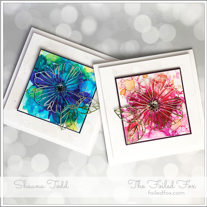
I have created the same card in two color schemes. Take a look at our latest video demonstrating all the steps.
This card design relies on the beautiful lines of the flower and leaf die to convey the floral theme and the vibrant colors of the inks make it pop. Another subtle but elegant feature of the card design is the tone-on-tone white background created by stamping and heat embossing the big blossom onto a Neenah white panel.
As you see in the video, a 3.5″ x 3.5″ square of Yupo paper was painted with the alcohol inks, then framed with a thin border of a solid background. All this is mounted onto a heat embossed white background, then onto a plain white card base. The different panels are popped up with foam.
Here are a few close-ups of each color scheme and the colors used.
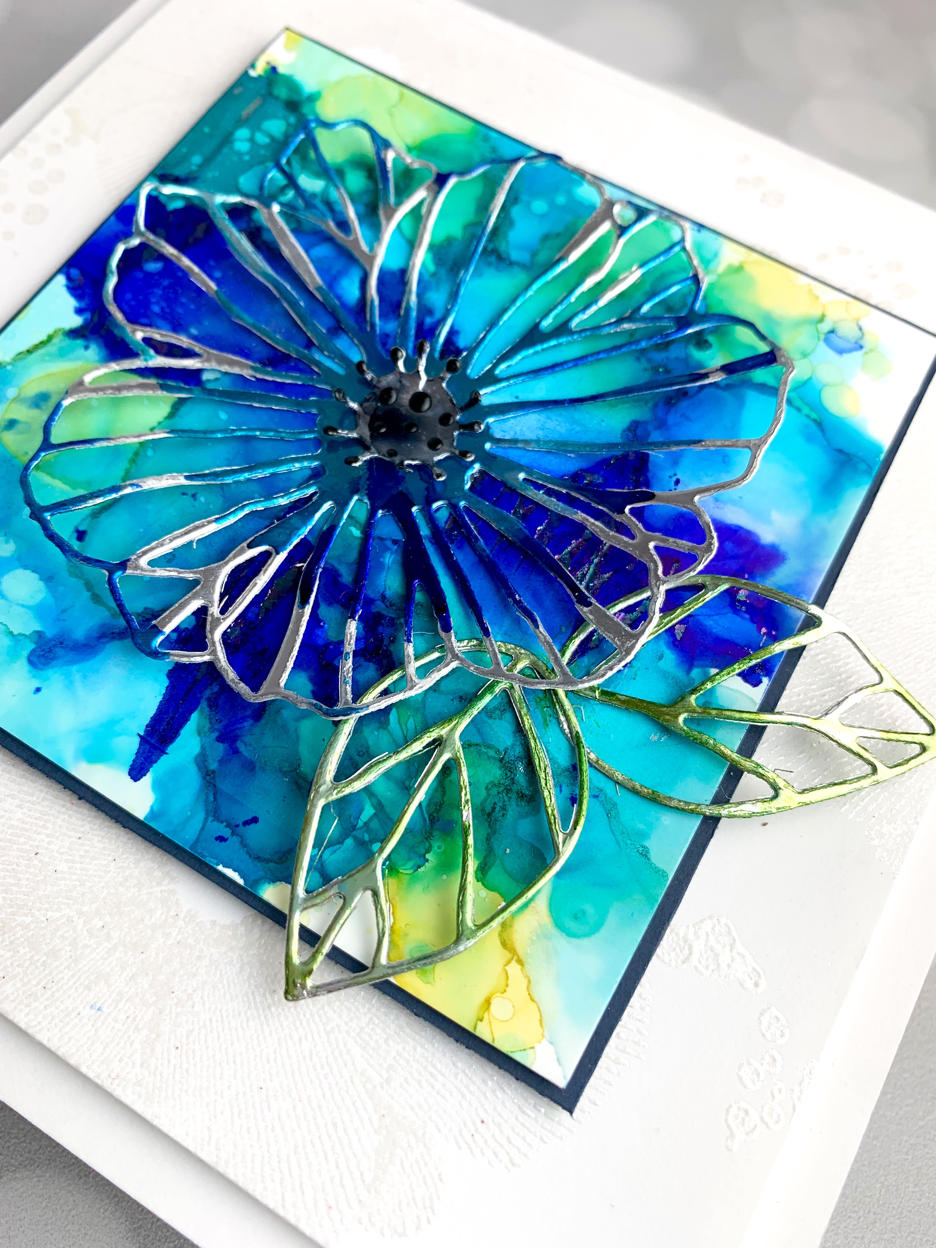
The alcohol ink colors used for this blue themed card are Mermaid, Indigo, Stream, Aquamarine, Aqua, and Sunshine Yellow. Dots of inks were dropped onto the Yupo paper with blending solution, then spread and smoothed out by using a squeeze bulb. If you don’t have one of those, then try using a straw or blowing on it. If you have work quickly though, alcohol inks dry super fast.
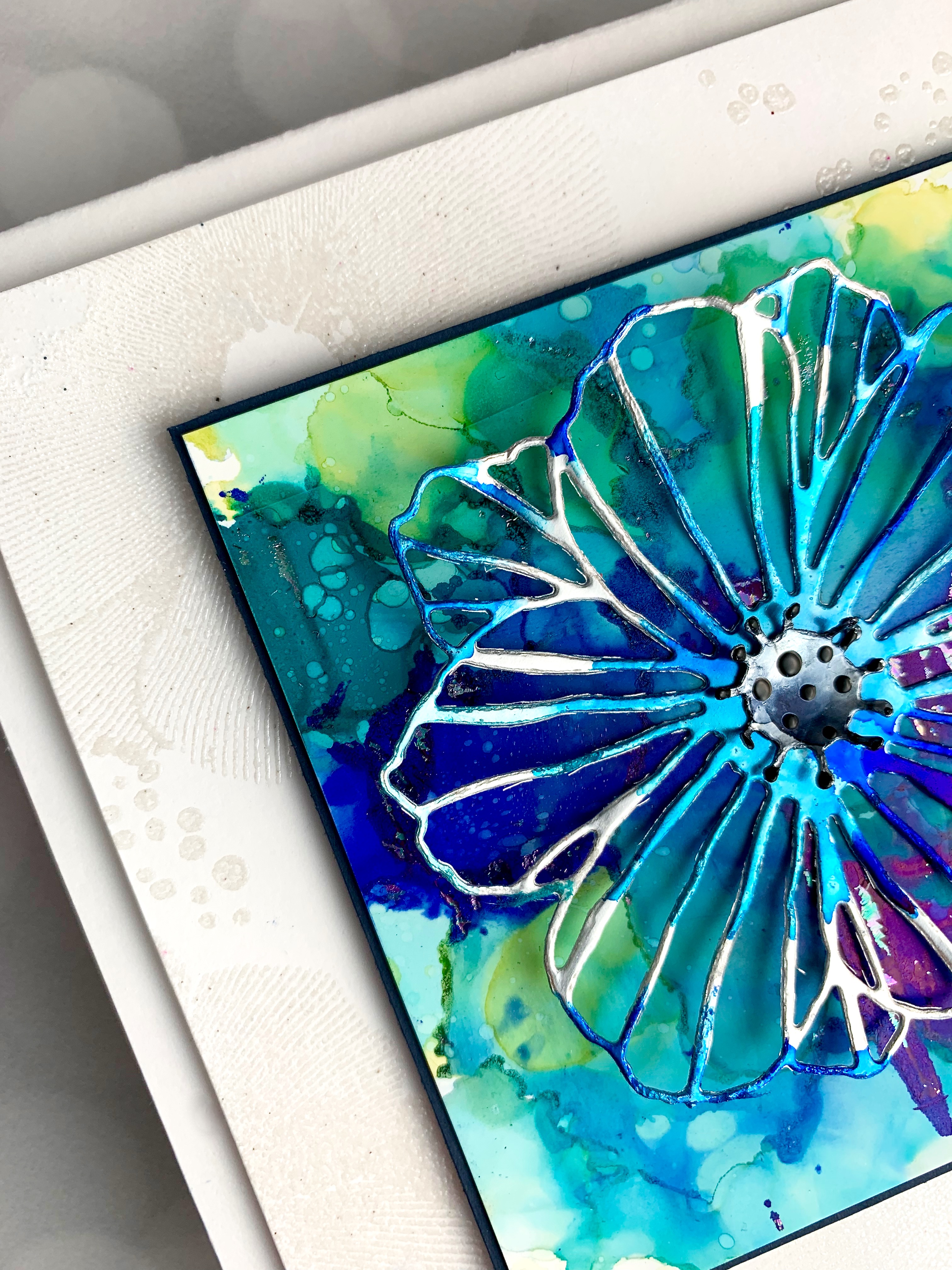
The outline of the flower and leaf were cut out of silver foil paper using the matching dies and then the flower was randomly colored with Mermaid and Indigo alcohol inks and the leaves colored with Meadow.
When the ink, in the thickest areas was tacky and not quite dry, I burnished on Opal foil flecks by rubbing the foil, face up onto the alcohol inked background. When finished, this panel was then mounted onto a Blueberry Sour (dark blue) panel. A foam square was applied to the back.
Next, was the stamping of the tone-on-tone background. A 5″ square Neenah white card panel was stamped randomly with the large flower stamp, along with the ‘intentional’ splatters. All these were stamped using Versamark ink and then heat embossed with White Satin Pearl embossing powder by Hero Arts. When finished, the tone-on-tone panel was mounted with foam and then onto a 5.5″ square (when folded) card base and the alcohol inked background with its solid border was added.
The final step was to add the flower and leaves with liquid glue.
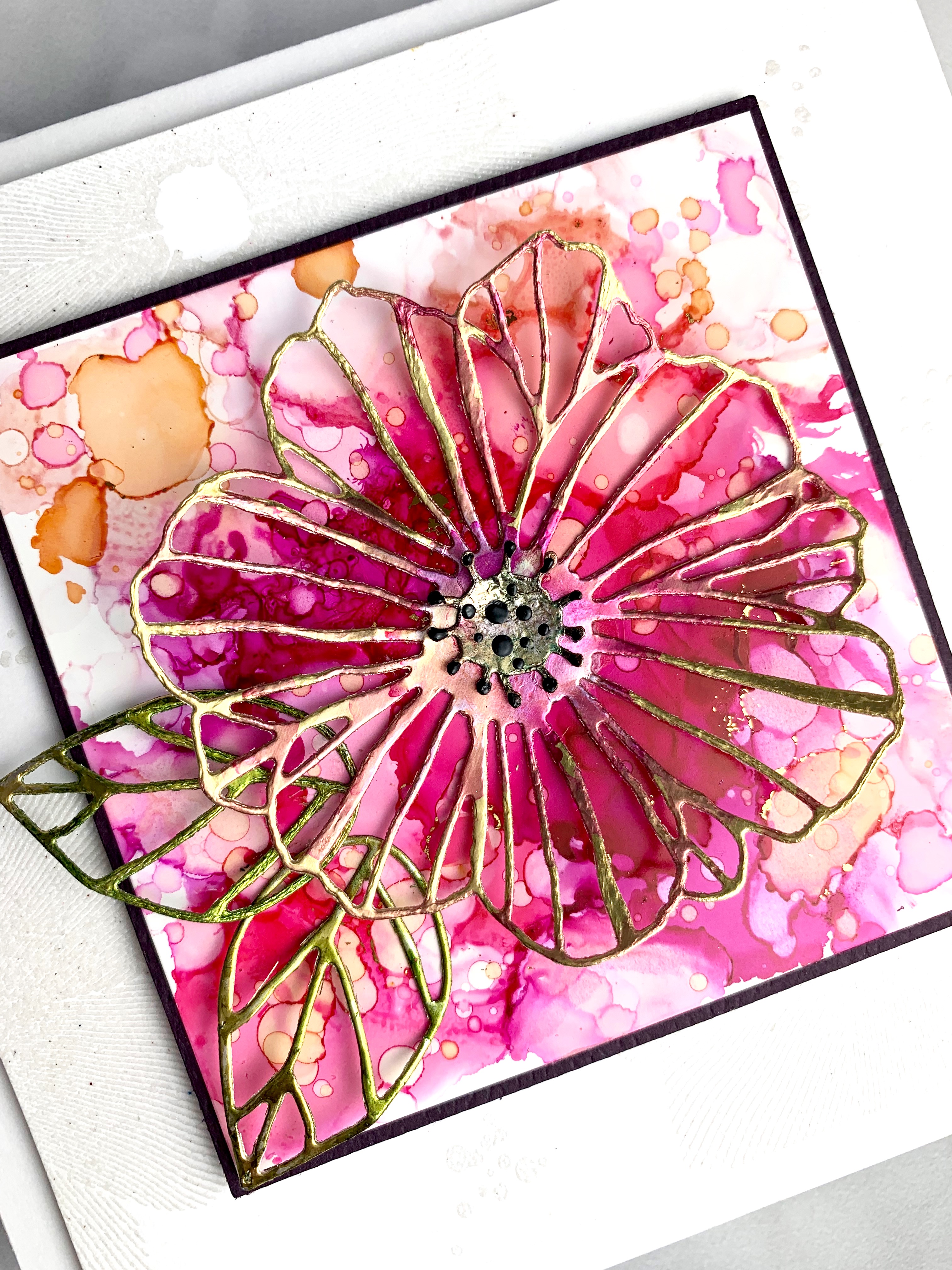
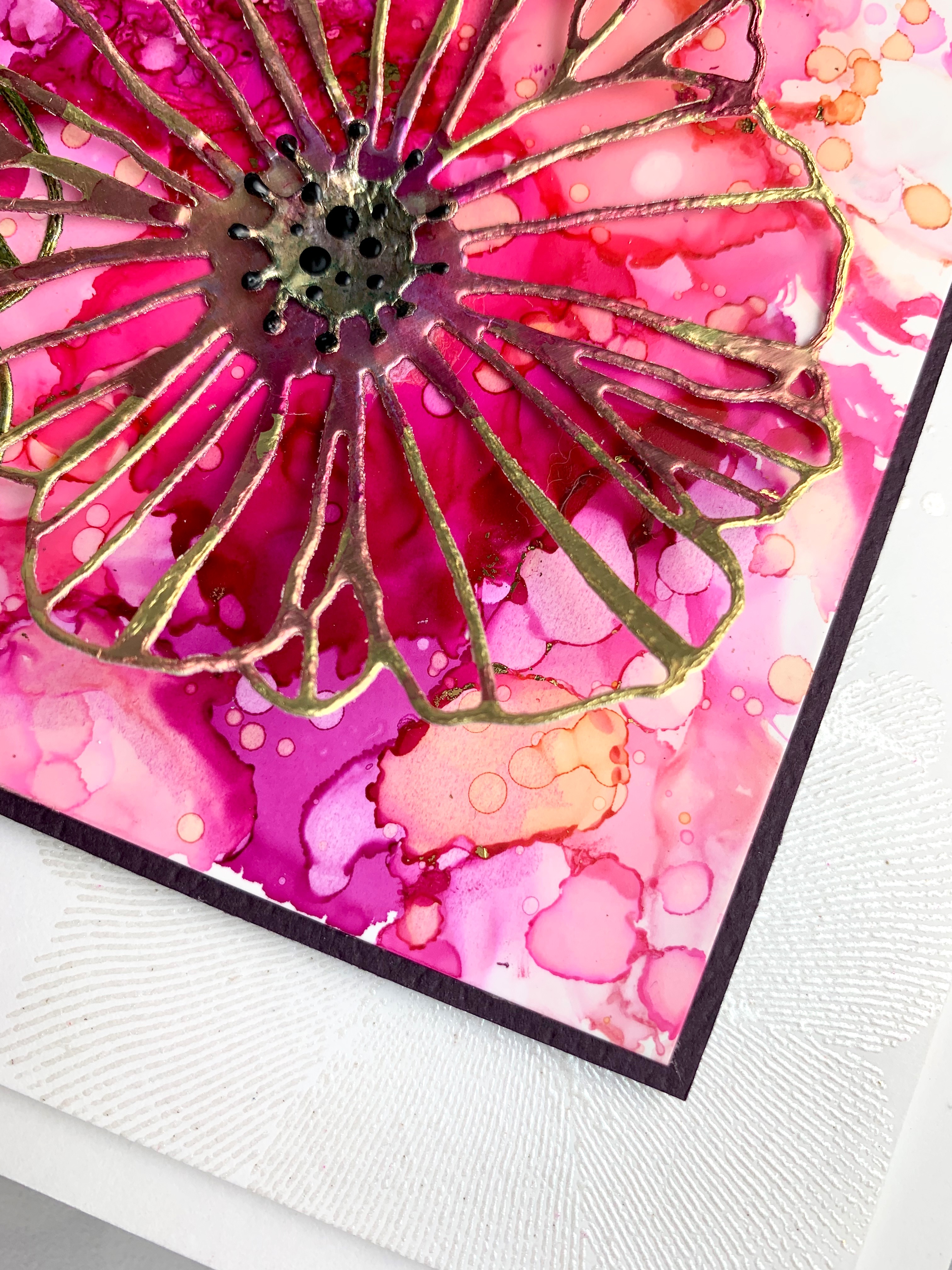
Here are the examples of the pink version. This card was created exactly the same way, the only difference was the alcohol inks used, the solid border and the foiled paper. For this color scheme, the following colors of ink were used: Shell Pink, Flamingo, Salmon, Wild Plum, and Sunset Orange. For a little sparkle, gold foil flecks were burnished on while the thickest areas were still tacky.
The solid border was added to give a narrow frame around the alcohol inked background. In this case, it was Aubergine card stock. The flower and leaves were die-cut from gold foil paper and randomly colored with Flamingo and Wild Plum. The leaves were colored with Meadow alcohol ink.
The assembly was just the same as the other card, including stamping and heat embossing a tone-on-tone background panel.
I hope you had a chance to view the video and that you enjoyed it. Please subscribe to our YouTube channel if you haven’t already so you don’t miss any upcoming videos. We would love that!
Thanks again and we will see you soon. ♥
Goodies Used:
Sorry, the comment form is closed at this time.



June 7, 2019
Jo-Anne
These are really quite pretty. I like the one with the pinks best.
Thanks for the inspiration!