How To Create With Gouache
Hi Crafty Friends,
Heather Telford, one of our very favorite guests is sharing three awesome card designs using gouache. If you haven’t used gouache before, no worries, she will walk you through the process and show you how easy it is to create stunning designs!
Hi my creative friends,
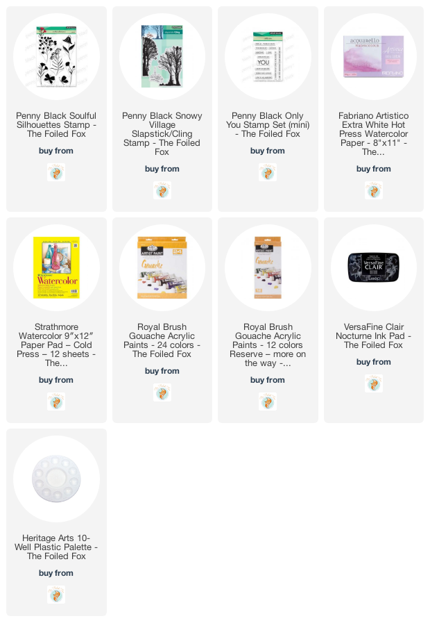
I am excited to share something new with you today. Recently the Foiled Fox sent me a set of gouache paints. I had been seeing more and more beautiful gouache designs on instagram and was keen to try it. The set has 24 colors but I haven’t tried them all yet. I know I should have swatched them first before playing but I was too impatient. I will swatch them soon which will help me make color choices for future projects.
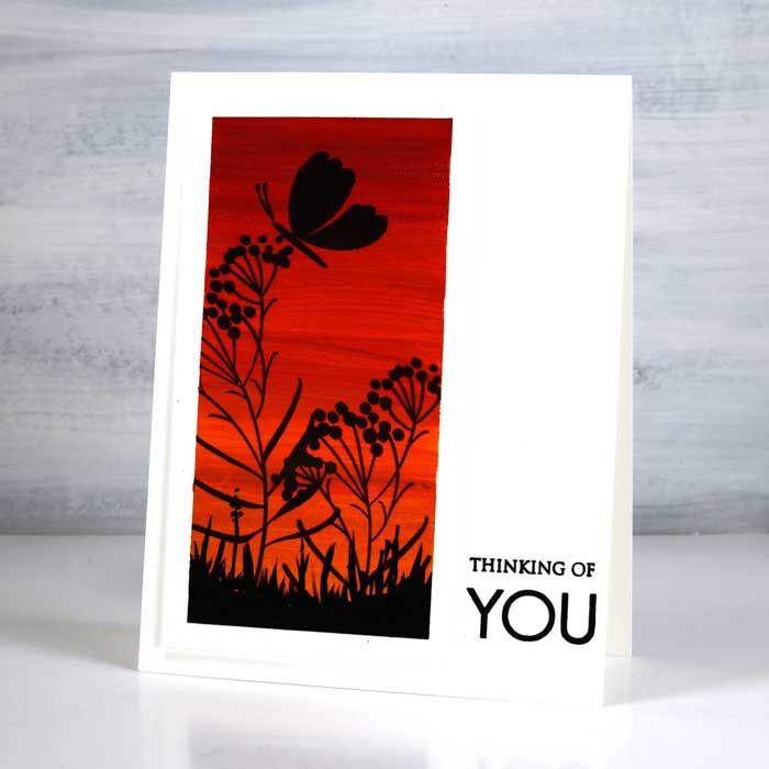
Gouache is like watercolor paint in some ways but not in others. It is water soluble but you mix it with water to get the right paint consistency unlike watercolor paint which you mix with water to get paler tones. With gouache you mix colors with white to get paler tones. Although you can dilute gouache to make it transparent it is designed to be opaque. I knew about the opacity but I learned the rest from watching youtube videos. I have watched several now to pick up hints and techniques for working with this ‘new to me’ medium.
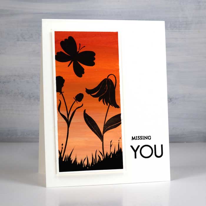
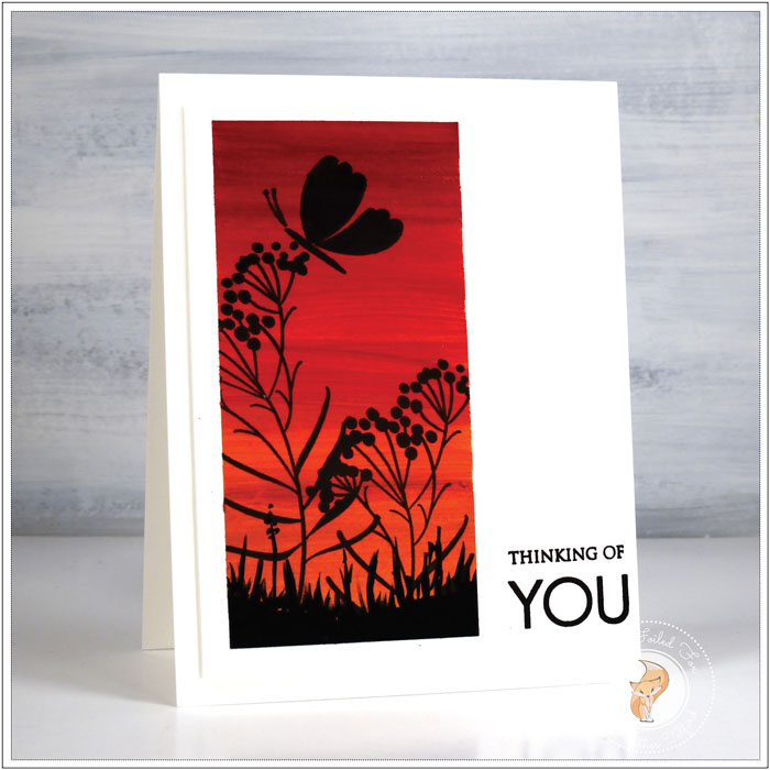
One of the first things I learned to do was blend from one color to another so I decided to paint skies. For interest I used the same two paints (yellow mid & crimson red lake) with and without white to paint gradated skies. On the darker panel I did not mix any white with the red, yellow or orange mix. On the darker panel I used some white with each mix I made so the overall effect is softer and more appealing as a background. It is possible to blend on the paper but I mixed the paints in a palette then painted from top to bottom.
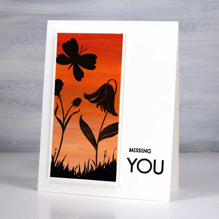
I worked on watercolor paper and was pleased to see how fast the paint dried. Because it is opaque I could paint over the top if I wanted to make adjustments; I just had to wait until each layer dried. I decided to stamp some of the PB soulful silhouette stamps over the top of the painted skies and was delighted with the way the versafine clair nocturne ink worked on the paint. I was able to get crisp solid images with one or two impressions. I used washi tape to mask the edges of my panels and found that while the gouache did not go through the tape the nocturne ink did if I stamped more than once.
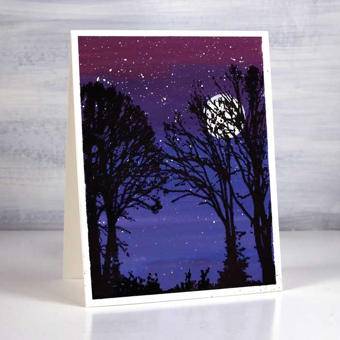
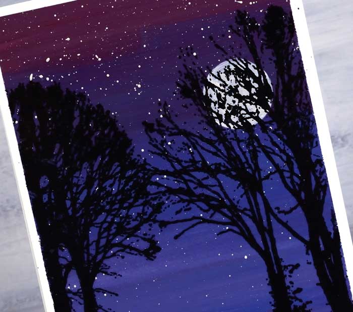
For the night scene I used prussian blue, cobalt blue and crimson red lake to make some purples. After the sky was dry I splattered white gouache for stars and painted a white moon. Once all the painting dried I stamped the trees from the ‘snowy village’ set. On all the panels I painted some grass along the base to ground the stamped images.
Have you tried gouache? What you have you used it for. I am practising painting flowers and leaves with gouache and hope to be back with some examples soon. I am also wanting to try it in my art journal and with stencils. Stay tuned, I will keep you posted.
Learn more about Heather:

