Color Trio with Concord & 9th Feathered + CHALLENGE
Woohoo! Are we ever excited!! We have a doubleheader today. First, we have the pleasure of featuring Heather Telford‘s wonderful Color Trio card designs. As you know, she is a super talent and she is sharing some of her brilliance today.
Then, to make it even more exciting, we are launching a card challenge today. All you have to do is create a card using only three (3) main colors (add a dash of white or black if you want to). Come along and play along with us. We are anxious to see all your beautiful talents! Prizes at the end of the challenge – YAY!!
I am excited to team up with the Foiled Fox again, this time for a challenge. I’ve made a couple of three-color cards to show you because when it comes to color I think three is something of a magic number. If you’d like to get involved make a card featuring only three colors (you can have a bit of black, white also but the colors must be the main event) – the link is down below to enter.
Just like most people, I have favorite colors and color combos but I also find it fun to try different mixes. I have discovered that limiting my colors is sometimes more visually pleasing than incorporating many colors into a design. Working with three colors often works well especially if I am mixing the three to get a few extra blended colors.
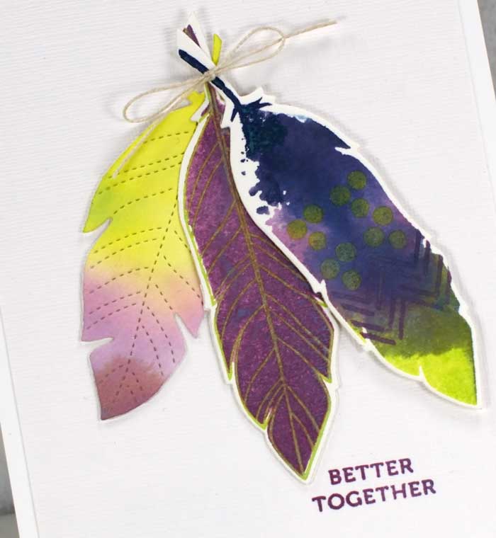
For both these feather cards, I used chipped sapphire, dusty concord and twisted citron distress oxide inks. On the first card, I used hot pressed watercolor paper and the solid feather stamp from the Concord & 9th ‘feathered stamp set’. One feather I inked with all three colors, spritzed some water over the ink so it would start to blend then stamped on the watercolor paper. Once it dried I used some of the decorative stamps to add dots and stripes then cut it out with the coordinating die. The middle feather I stamped in dusty concord then stamped over the top with twisted citron. That is a handy feature of oxide inks, it is possible to stamp light inks over the top of darker colored inks. The left-hand feather was die cut from watercolor paper I had swiped through diluted inks on my glass mat. I glued the left-hand feather directly to the canvas textured white panel, then popped up the other two feathers on dimensional tape and added a little twine bow around the ends.
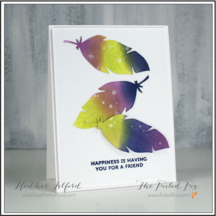
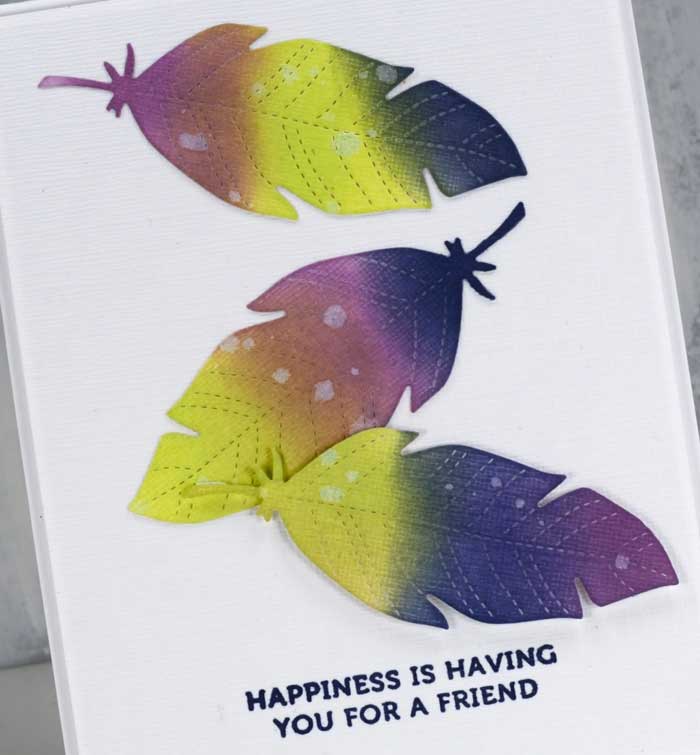
For my second card, I die-cut the feathers from white textured cardstock then blended the three oxide inks over the die cuts before sprinkling some drops of water over the inking and dabbing it up with a paper towel to leave watermarks. I attached two feathers directly to the panel of textured white cardstock and popped one up on dimensional tape. The textured white panel is also raised on white foam.
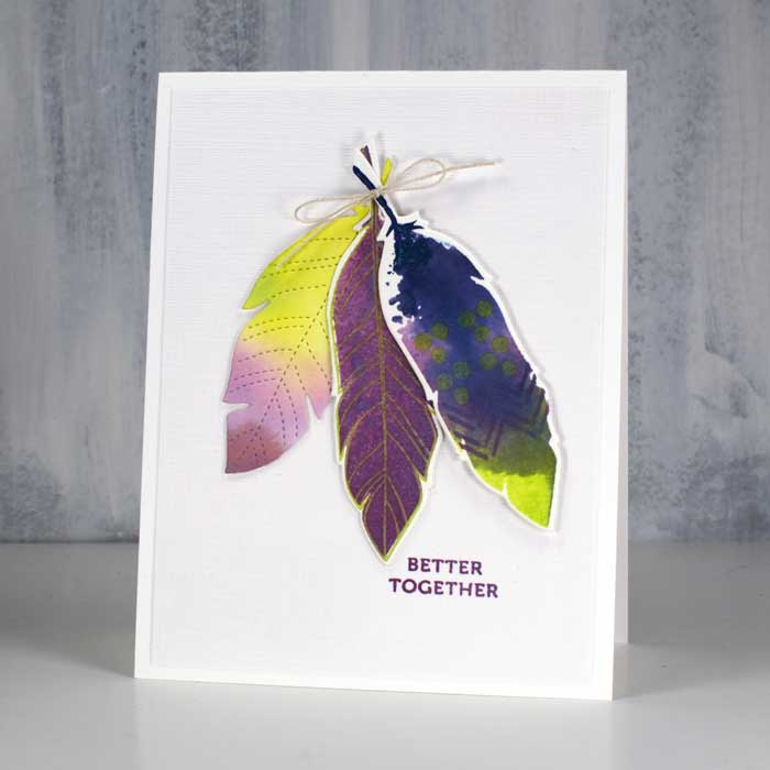
I added a sentiment to each card from the same ‘feathered set’. Even though purple and blue are beside each other on the color wheel I would still call this color scheme a complementary color scheme because yellow-green is directly opposite purple. When complementary colors are placed side by side as they are in these cards the colors really pop. Thanks for joining me today; I’d love to hear or see what colors you like to put together.
So now it’s your turn! I hope you join us; I’d love to see your color combos. The challenge will be open until May 30th. And yes there will be prizes. Click on the blue button below to link up your card.
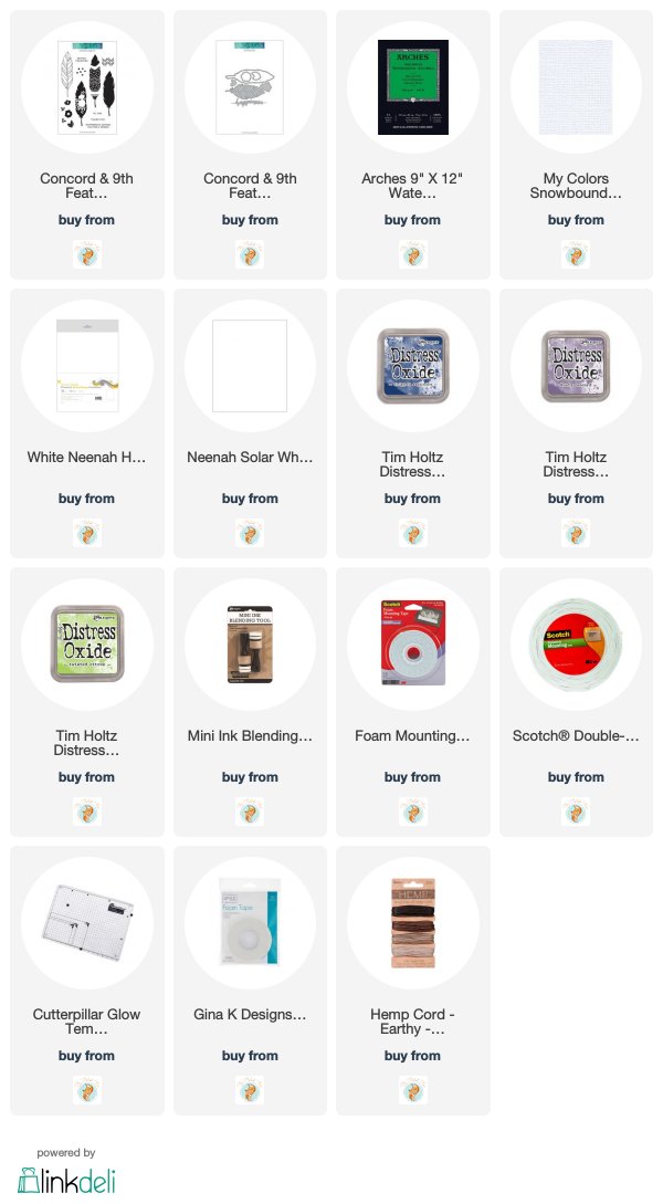
Supplies Used:
