Magical Forest by Zinia
Hello Friends,
I don’t know about you, but we had so many visiting us that it was a whirlwind of activity and fun. But now all have departed, and that means back to making some papercraft fun. To kick off a new year a little early, Zinia of Abstract Inspiration is back with us, sharing a beautiful art journaling spread: Magical Forest. The colors are so luscious creating a mysterious journey deep into the forest!
Be sure to check out her video and mini bio below. Then, after you have soaked in all her brilliant inspiration, here over to her blog for a lot more!
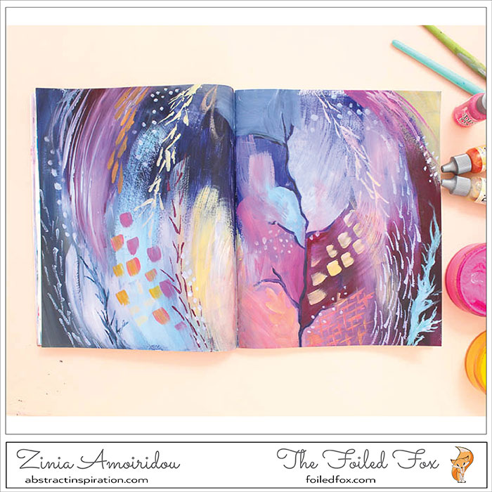
This month I’m going back to my favorite paints and I’m working on a yet another magical spread. After a long time of having Distress Oxides monopolize my art journal, I decided it was time for a change so I grabbed a few Dylusions acrylic paints and I started playing.
https://youtu.be/ydgPyyZU22U
I didn’t have an actual plan when I started working on this page so I picked a variety of colors that I thought they’d work well together. I made sure to include some deeper dark shades as well as white to build up a lot of contrast and depth.
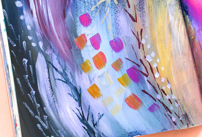
My only guideline was that I wanted to create a magical scene. In situations like that, when I don’t have a specific idea in mind, I start by building my background using all the different colors from my palette. That helps me balance the colors later on as I add more layers and elements to the page.
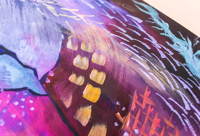
To start building my scene I go for some random intuitive marks. Just putting my brush down and let it release the color without overthinking it. As the layers add up the page will create itself.
It’s always helpful to remember and keep your colors balanced. If I add a big area of blue on one side I usually add one or two smaller areas on the opposite side to make sure everything is spread evenly and it’s pleasing to the eye.
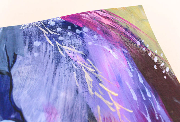
Don’t be afraid to mix your colors. In fact, I’d encourage you to mostly use mixes of your paints instead of using the right off the tube (or pot). That helps you create a harmonious color palette. It’s always a good idea to use a limited amount of paints and then try to create new shades by mixing them together.
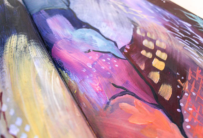
It can be tricky to blend acrylics, especially when we are working with small amounts of paint in our journal. My favorite technique to blend colors on the page is to use a dry (or slightly damp) brush. It creates a smooth blend and it also leaves a really beautiful texture from the bristles.
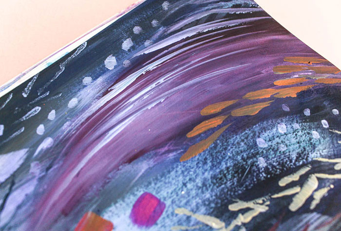
I really hope you enjoyed this page. This time it wasn’t much of a tutorial but I think you can get some useful tips from here to use in your art.
••••••••••••••••••••••••••••••••••••••••••

Supply List:
|
|
Sorry, the comment form is closed at this time.




December 28, 2017
Lori
Really pretty, I love the colors!
January 17, 2018
Lagene
WOWZERS! This is absolutely GORGEOUS! I love seeing your entire process in the video!