Hi Everyone,
Today we are welcoming back Heather Telford. I am sure most of you know Heather as she makes the most beautiful cards. She always has a knack for turning a stamping into a piece of art.
Today’s card featuring yummy Fall-like colors and has a special elegance to it. Find out just how she does it… and don’t forget to pop over to her blog for oodles of inspiration.
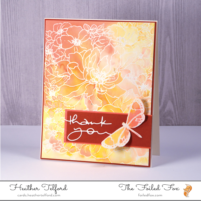
Here’s Heather:
Hi there, once again the lovely crew at Foiled Fox have allowed me to move in on their blog for a day. When the first distress oxide inks came out The Foiled Fox sent me some and I had great fun experimenting and putting them through their paces. When the next twelve colors came out you can be sure I said, ‘yes please’. If you haven’t tried them yet pick a couple of colors you really like and just play with them. They make beautiful backgrounds in their intense ‘direct to paper’ form and in the diluted and oxidized form.
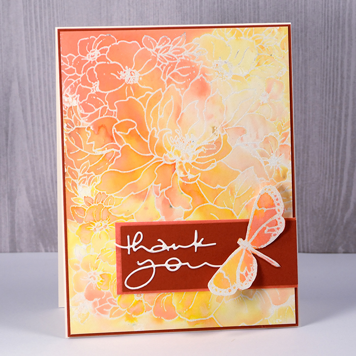
To create the background for this card I combined two of the new colors, wild honey and abandoned coral with spiced marmalade from the first release. I started with a piece of hot pressed watercolor paper and embossed the Penny Black ‘sweet perfume’ stamp using a Versamark pad and clear embossing powder. I pressed each of the distress oxide ink pads face down onto a craft mat so I got a nice bit of ink on the mat, then spritzed the ink to dilute it and make it bead. I swiped my embossed panel right through the ink twice then held it up so the colour could flow down the panel. Any spaces that missed ink entirely I painted by picking up the ink off the craft mat with a paint brush. If the color was not fluid enough I lightly spritzed with water. I decided to let the panel dry naturally while still leaning at an angle.
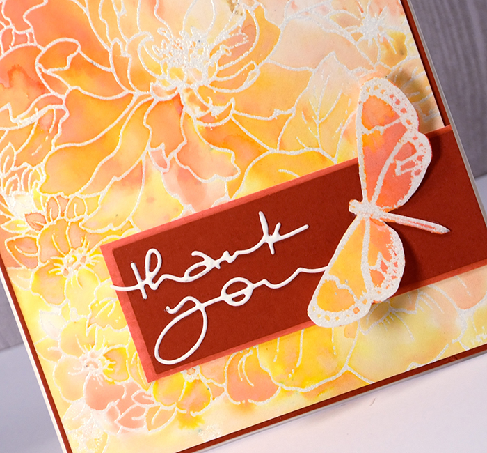
To create the butterfly detail I stamped the smallest of the Penny Black butterfly trio set, embossed then coloured it with the same three inks in the same fashion as the background. Next came a rather lengthy process of trying layouts, sentiments and cardstock colors. My sister-in-law is visiting and between us, we narrowed it down to the dark cardstock strip which gives a bold background to the sentiment and butterfly and a frame to the whole panel. The bold brick color is not actually featured in the inked panel so I softened it with a coral colored mat. As I didn’t have the exact coral color in an existing cardstock I just swiped the distress oxide abandoned coral ink across a piece of watercolor paper, dried it then trimmed it to frame the brick strip. It always warms my matchy-matchy heart to have everything coordinate. I chose the delicate ‘many thanks’ die to cut a sentiment from watercolor paper and attached it along side the butterfly.
••••••••••••••••••••••••••••••••••••••••••
••••••••••••••••••••••••••••••••••••••••••
Supply List:
 Sweet Perfume stamp |
 Trio by Penny Black |
 Black Many Thanks Die Set |
 Hot Press Watercolor Paper |
 Neenah Cardstock |
 Butter Fudge Card stock |
 Coral Distress Oxide Ink Pad |
 Honey Distress Oxide Ink Pad |
 Marmalade Distress Oxide Ink |
 Watermark Ink Pad |
 Clear Embossing Powder |  Non-Stick Craft Sheet |
 Holtz Distress Sprayer |

Oooo…I love this color combination and the variegation within the card is wonderful.♥
Such a beautiful background and card!
This card is delicately stunning! As always I love how you use the supplies to create different looks. Thank you for sharing your technique and allowing us all to learn.
A beautiful card from Heather using the new oxide inks in those beautifull colours and the background stamp with the feature butterfly looks gorgeous. I love the choice of card for the matting and layering too, and a great idea to use the ink on a piece of white card to get the exact colour match for the mat nearest to the background. x