Serene and Tranquil Wild Fields
Hi Crafty Friends,
I am super excited to share a brand new stamp set from the latest release of Papertrey Ink-Ink To Paper. It is called Wild Fields and it offers a serene and tranquil vibe to these card designs.
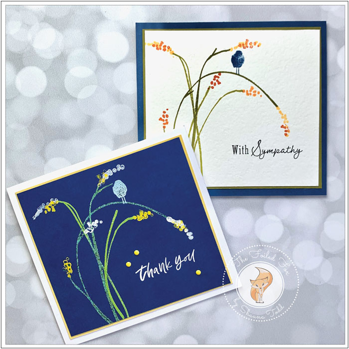
For these card designs, I used a few of the elements in the set, one on a lighter background, and then, I’ll show you how to get vibrant colors on a dark background!
So get comfy and enjoy the video below.
I hope you had a chance to view the video and learned something along the way. Here are a few close-ups to the projects featured in the video.
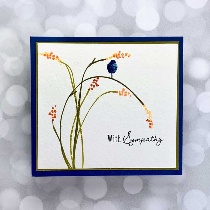
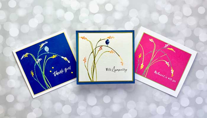
This design uses the Luxe White card stock for its front panel. This card stock has a handmade textured feel to it and is a very light cream color. Combine the paper with a few stamps and Papertrey Ink ink cubes and your are well on your way to being done.
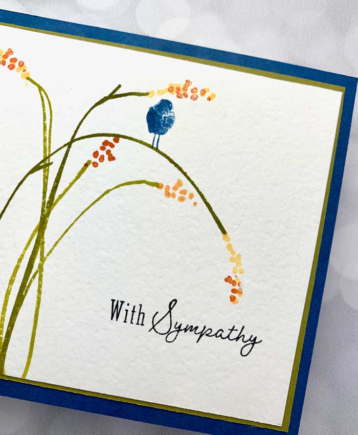
All the papers and colors used are listed in the “Goodies Used” list below but for a quick reference, the front panel was matted with a slightly larger panel of Ripe Avocado card stock and then mounted onto a Luxe White card base with a blue Whirlypop front. The inks used were Ripe Avocado, Simply Chartreuse, Harvest Gold, Canyon Clay, and True Black for the sentiment.
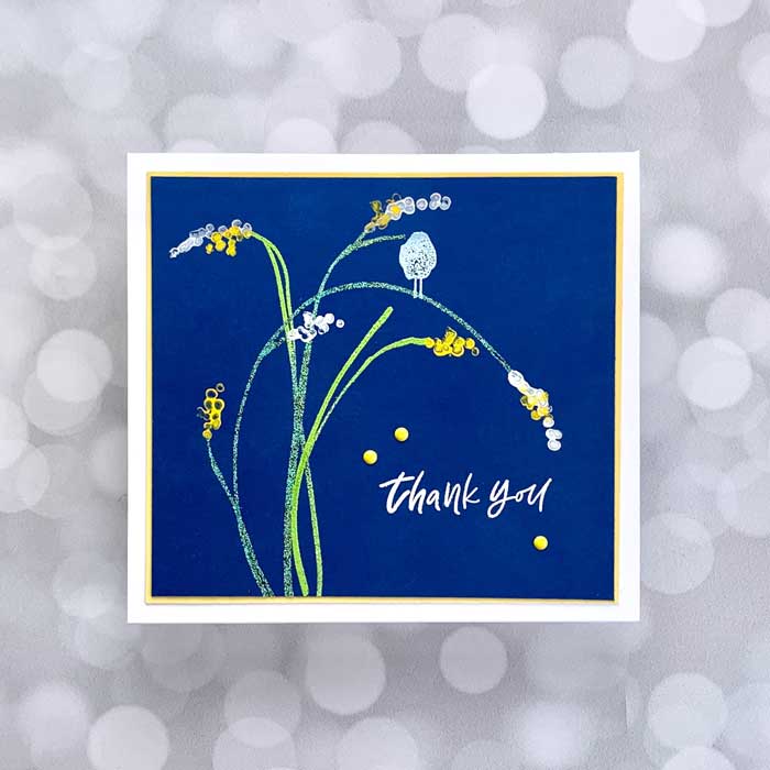
The above card design was created using a blue Whirlypop front panel that had been heat-embossed with Verdigris and Leaf Green embossing powder. The little bird was also heat embossed, using Sky Blue embossing powder.
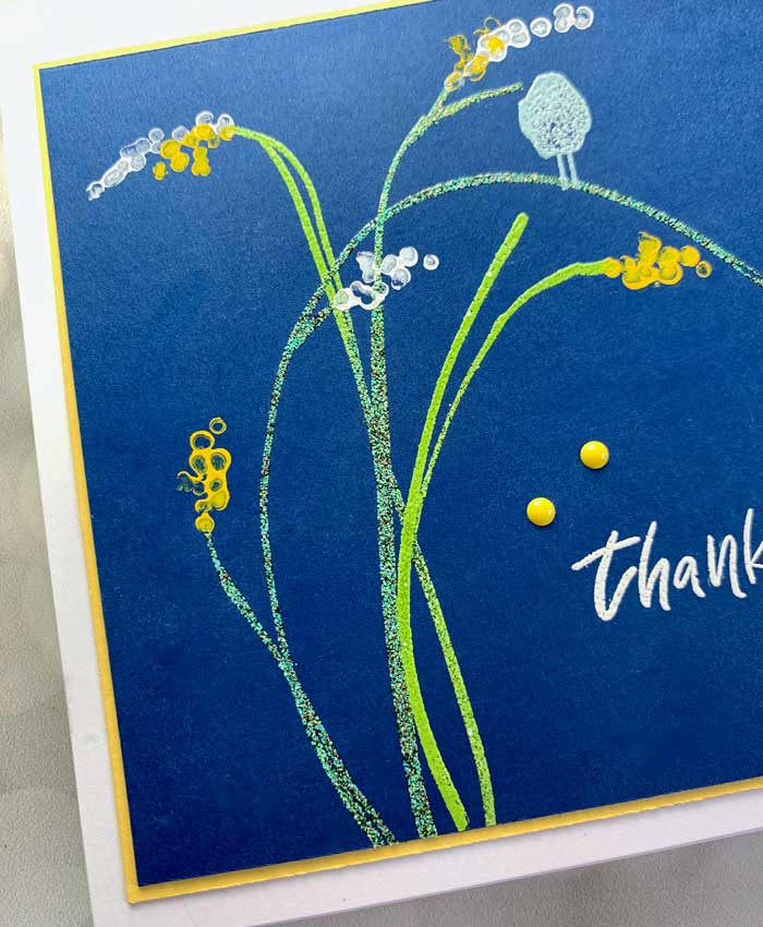
The vibrant blooms were made by gently inking the stamp with white and bright yellow gouache paint. The beauty of the gouache is that it is an opaque, water-based paint, making it ideal for achieving those bright colors on dark backgrounds.
The front panel was matted with a bright yellow panel and then mounted on a white card base.
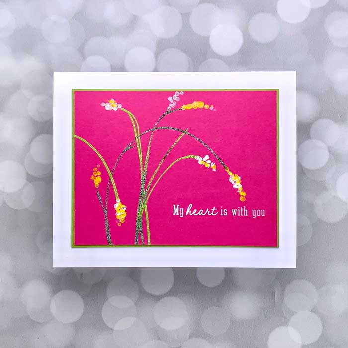
The last card above was one I did off-camera but I still wanted to share it to show how you can change the mood of the card simply by changing the colors used.
Thank you so much for joining me today. I hope you enjoyed it and will stay tuned for our next adventure! ♥


